
Where front components can be used
Front components can render in two locations within Clara:- Side panel — Non-headless front components open in the right-hand side panel. This is the default behavior when a front component is triggered from the command menu.
- Widgets (dashboards and record pages) — Front components can be embedded as widgets inside page layouts. When configuring a dashboard or a record page layout, users can add a front component widget.
Basic example
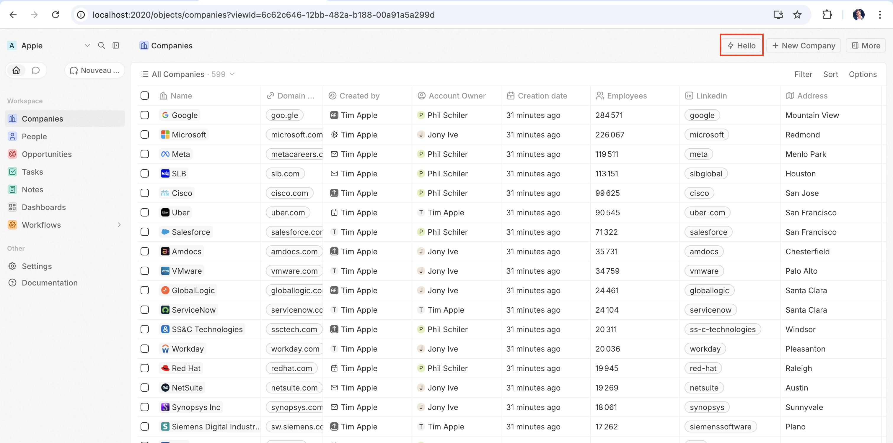
The quickest way to see a front component in action is to register it as a command. Adding acommand field with isPinned: true makes it appear as a quick-action button in the top-right corner of the page — no page layout needed:
src/front-components/hello-world.tsx
yarn twenty dev (or running a one-shot yarn twenty dev --once), the quick action appears in the top-right corner of the page:
Configuration fields
Placing a front component on a page
Beyond commands, you can embed a front component directly into a record page by adding it as a widget in a page layout. See the definePageLayout section for details.Headless vs non-headless
Front components come in two rendering modes controlled by theisHeadless option:
Non-headless (default) — The component renders a visible UI. When triggered from the command menu it opens in the side panel. This is the default behavior when isHeadless is false or omitted.
Headless (isHeadless: true) — The component mounts invisibly in the background. It does not open the side panel. Headless components are designed for actions that execute logic and then unmount themselves — for example, running an async task, navigating to a page, or showing a confirmation modal. They pair naturally with the SDK Command components described below.
src/front-components/sync-tracker.tsx
null, Clara skips rendering a container for it — no empty space appears in the layout. The component still has access to all hooks and the host communication API.
SDK Command components
Thetwenty-sdk package provides four Command helper components designed for headless front components. Each component executes an action on mount, handles errors by showing a snackbar notification, and automatically unmounts the front component when done.
Import them from twenty-sdk/command:
Command— Runs an async callback via theexecuteprop.CommandLink— Navigates to an app path. Props:to,params,queryParams,options.CommandModal— Opens a confirmation modal. If the user confirms, executes theexecutecallback. Props:title,subtitle,execute,confirmButtonText,confirmButtonAccent.CommandOpenSidePanelPage— Opens a specific side panel page. Props:page,pageTitle,pageIcon.
Command to run an action from the command menu:
src/front-components/run-action.tsx
CommandModal to ask for confirmation before executing:
src/front-components/delete-draft.tsx
Accessing runtime context
Inside your component, use SDK hooks to access the current user, record, and component instance:src/front-components/record-info.tsx
Host communication API
Front components can trigger navigation, modals, and notifications using functions fromtwenty-sdk:
Here is an example that uses the host API to show a snackbar and close the side panel after an action completes:
src/front-components/archive-record.tsx
Command options
Adding acommand field to defineFrontComponent registers the component in the command menu (Cmd+K). If isPinned is true, it also appears as a quick-action button in the top-right corner of the page.
Conditional availability expressions
TheconditionalAvailabilityExpression field lets you control when a command is visible based on the current page context. Import typed variables and operators from twenty-sdk to build expressions:
Operators — combine variables into boolean expressions:
Public assets
Front components can access files from the app’spublic/ directory using getPublicAssetUrl:
Styling
Front components support multiple styling approaches. You can use:- Inline styles —
style={{ color: 'red' }} - Clara UI components — import from
twenty-sdk/ui(Button, Tag, Status, Chip, Avatar, and more) - Emotion — CSS-in-JS with
@emotion/react - Styled-components —
styled.divpatterns - Tailwind CSS — utility classes
- Any CSS-in-JS library compatible with React