
前端组件可用位置
在 Twenty 中,前端组件可在两个位置进行渲染:- 侧边栏 — 非无头的前端组件会在右侧侧边栏中打开。 当前端组件从命令菜单触发时,这是默认行为。
- 小部件(仪表盘和记录页面) — 前端组件可以作为小部件嵌入页面布局中。 在配置仪表盘或记录页面布局时,用户可以添加前端组件小部件。
基础示例
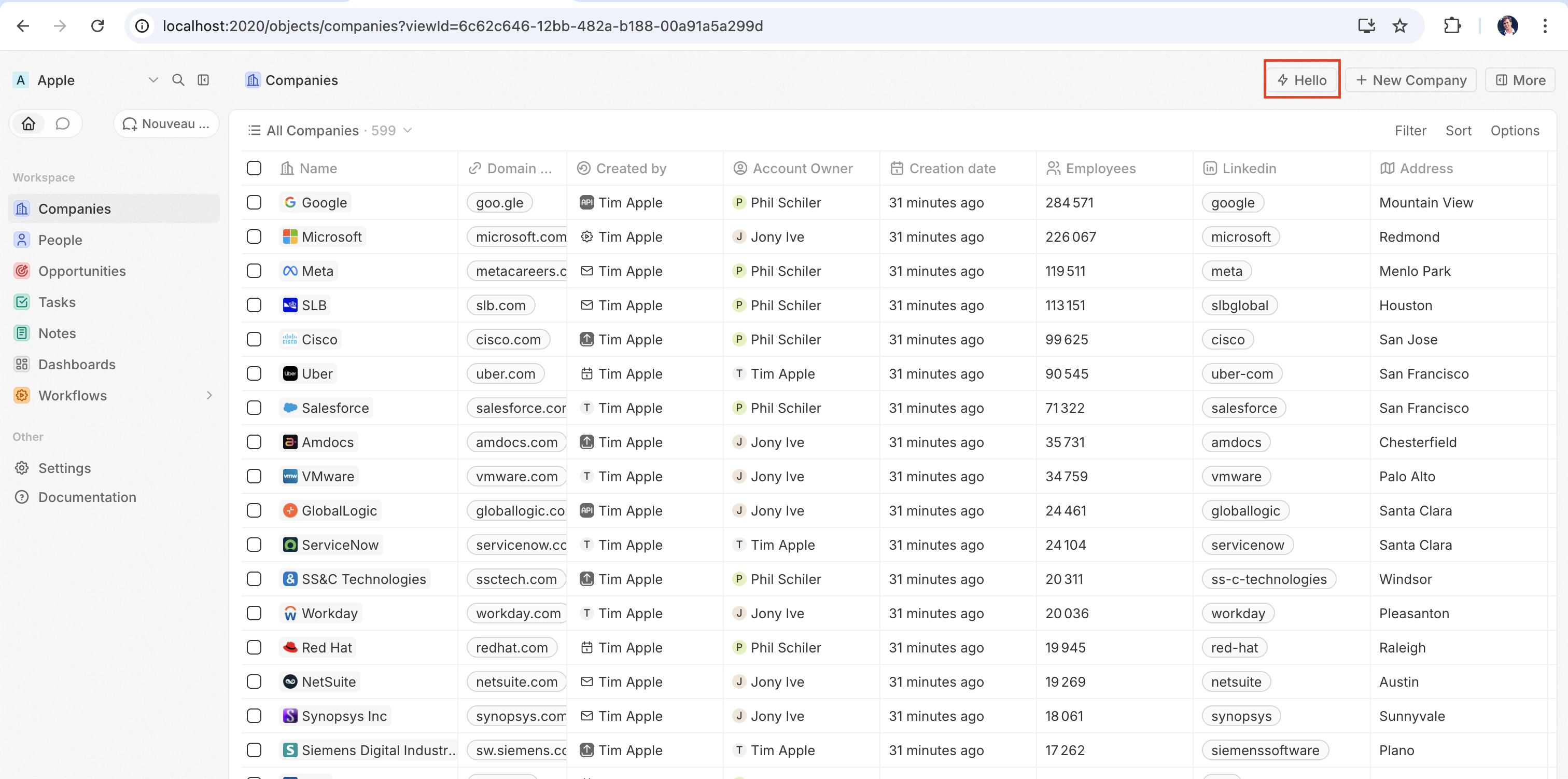
最快体验前端组件运行方式的方法是将其注册为一个命令。 添加一个command 字段并设置 isPinned: true,即可让它以快速操作按钮的形式出现在页面右上角——无需页面布局:
src/front-components/hello-world.tsx
yarn twenty dev 同步后(或单次运行 yarn twenty dev --once),快速操作会出现在页面右上角:
配置字段
Placing a front component on a page
Beyond commands, you can embed a front component directly into a record page by adding it as a widget in a page layout. See the definePageLayout section for details.无头与非无头
前端组件有两种由isHeadless 选项控制的渲染模式:
非无头(默认) — 该组件会渲染可见的 UI。 从命令菜单触发时,它会在侧边栏中打开。 当 isHeadless 为 false 或被省略时,这是默认行为。
无头 (isHeadless: true) — 该组件会在后台以不可见的方式挂载。 它不会打开侧边栏。 无头组件旨在用于执行逻辑后自行卸载的操作——例如运行异步任务、导航到某个页面或显示确认模态框。 它们与下文介绍的 SDK Command 组件天然契合。
src/front-components/sync-tracker.tsx
null, Twenty skips rendering a container for it — no empty space appears in the layout. The component still has access to all hooks and the host communication API.
SDK Command 组件
twenty-sdk 包提供了四个为无头前端组件设计的 Command 辅助组件。 每个组件都会在挂载时执行一个操作,通过显示 snackbar 通知来处理错误,并在完成后自动卸载该前端组件。
从 twenty-sdk/command 导入它们:
Command— 通过execute属性运行异步回调。CommandLink— 导航到某个应用路径。 属性:to、params、queryParams、options。CommandModal— 打开一个确认模态框。 如果用户确认,则执行execute回调。 属性:title、subtitle、execute、confirmButtonText、confirmButtonAccent。CommandOpenSidePanelPage— 打开特定的侧边栏页面。 属性:page、pageTitle、pageIcon。
Command 从命令菜单运行一个操作:
src/front-components/run-action.tsx
CommandModal 在执行前请求确认:
src/front-components/delete-draft.tsx
Accessing runtime context
Inside your component, use SDK hooks to access the current user, record, and component instance:src/front-components/record-info.tsx
Host communication API
Front components can trigger navigation, modals, and notifications using functions fromtwenty-sdk:
下面是一个示例,使用宿主 API 在操作完成后显示一条 snackbar 并关闭侧边栏:
src/front-components/archive-record.tsx
Command options
Adding acommand field to defineFrontComponent registers the component in the command menu (Cmd+K). If isPinned is true, it also appears as a quick-action button in the top-right corner of the page.
Conditional availability expressions
TheconditionalAvailabilityExpression field lets you control when a command is visible based on the current page context. Import typed variables and operators from twenty-sdk to build expressions:
Operators — combine variables into boolean expressions:
Public assets
Front components can access files from the app’spublic/ directory using getPublicAssetUrl:
样式
Front components support multiple styling approaches. You can use:- Inline styles —
style={{ color: 'red' }} - Twenty UI components — import from
twenty-sdk/ui(Button, Tag, Status, Chip, Avatar, and more) - Emotion — CSS-in-JS with
@emotion/react - Styled-components —
styled.divpatterns - Tailwind CSS — utility classes
- Any CSS-in-JS library compatible with React